
Improving GoodGym’s User Engagement with Landing Pages for conversion to Information Pages and signup
Category:
Improving GoodGym’s User Engagement with Landing Pages for conversion to Information Pages and signup
Category:
Improving GoodGym’s User Engagement with Landing Pages for conversion to Information Pages and signup
Category:

GoodGym is an organisation that helps people get fit by doing good. A not-for-profit organisation founded in 2009 that encourages people to combine exercise with doing something good for the community.
They currently have 2,300 members running in 24 different areas such as Liverpool and Bristol as well as the London boroughs of Camden, Hackney, Tower Hamlets and now Lambeth. Good Gym supports local projects, and you can choose from three different programmes.
Running in a group to work on a community project and/or support elderly people in the community, by doing one off missions or committing to a weekly social visit.

GoodGym’s Problem
GoodGym’s Problem
Users easily find their website, however the landing and informational pages currently in place have an exceptionally high bounce rate.
Of those that persevere and begin the process of sign up, only 16% become active members. There is an overall loss of 84% of potential users who initially visit the landing page.
GoodGym admitted that the approach to date had been to screen users at the landing page by only offering further information about GoodGym and its events after the user had completed initial signed up.
The priority was placed on gaining user data upload, before giving them sufficient information to make an informed decision about full membership, an approach that was proving unhelpful.
Development Phase
Development Phase


Our Challenge
Our Challenge
To reduce the challenge users were encountering between the landing page and signup and further from signup to full membership.
The key goal of the project was having completed signup, that users knew and fully understood the expectations of the events offered sufficiently to proceed to membership and participation in GoodGym activities. This would have a significant impact on the success of GoodGym.org.
Success for this project was defined by a 34% decrease in the signup bounce rate and a 16% increase in the signup conversion rate to full membership.

Possible Solution
Possible Solution
Provide more information to give the user confidence to continue the signup process and ultimately membership process.
Provide more information to give the user confidence to continue the signup process and ultimately membership process.
Hoped for Outcome
Hoped for Outcome
Bounce rate reduced at signup with a significant number of users proceeding to full membership.
Bounce rate reduced at signup with a significant number of users proceeding to full membership.
The Brief
The Brief
The Opportunity
The Opportunity
GoodGym have a great opportunity to increase their membership in the New Year because many people decide to take up exercising in that period. They will be increasing their marketing efforts and as a result they’re expecting a surge of new visitors to their website.
The Aim is to:
* Significantly improvement their landing and
informational pages and gain greater user engagement
and click through
* Increase the number of people going through the signup
process to membership
* Allow users a better pathway for becoming a GoodGym
member
* Encourage more users to get fit by doing good
* Demonstrate this with analytics showing a decrease in
the homepage bounce rate and an increase in the signup
conversion rate
* To thereby have a massive impact on the success of
their organisation.
Target Device: Responsive website and mobile.

Expected Deliverables
Expected Deliverables
Research insight & findings concerning competitors, user types and behaviour
Personas and scenarios
Experience map/User journeys
Information Architecture
Design & usability recommendations for improvement
User flows and Screen flows
Product Sketches and wireframes
High fidelity mock up
Prototype of design(s)
A final presentation to the client which summarises the UX work
GoodGym’s Why Statement
GoodGym’s Why Statement
By making improvements to the website landing and information pages there will be an increase in the number of people going through the signup process to membership, allowing users the opportunity they want, ‘Keeping fit by doing good’.
The user’s why statement would be determined following user research.
Project Planning
Project Planning
We created a schedule to give us a realistic timeline to
work to.
We created a schedule to give us a realistic timeline to
work to.

We developed this onto a Trello Board to divide the project into do-able chunks amongst the team and project managed the various stages.
We developed this onto a Trello Board to divide the project into do-able chunks amongst the team and project managed the various stages.

Design Method
Design Method
We employed the double diamond design methodology.
The first stage for us in the Double Diamond Design process is Discover, which consisted of a competitor analysis, contextual enquiry and user research to answer the questions:
* How have competitors solved this problem?
* What are the users needs that are not being met?

Discovery Phase — Behaviour-led Design Research
Discovery Phase — Behaviour-led Design Research
Competitor Analysis
Competitor Analysis
As GoodGym has a relatively unique value proposition our competitor analysis looked at the closest competitors or indirect competitors, such as running clubs and volunteering websites.
Green Gym was the closest-fit indirect competitor.
British Military Fitness was also a comparable indirect competitor without the volunteering/charity option, as was Nike Run Club.
The result was that there were those who concentrated on running and others more on charitable works, but none occupied the position that GoodGym had by covering both in such a comprehensive and unique way.


Key Takeaway
Key Takeaway
The key takeaway from the competitor analysis was that GoodGym was unique in the sparseness of information that they provided on the landing page. Users really had to work hard to find out what GoodGym was exactly about.
The key takeaway from the competitor analysis was that GoodGym was unique in the sparseness of information that they provided on the landing page. Users really had to work hard to find out what GoodGym was exactly about.
User Research
User Research
We conducted a series of Usability Tests, User interviews and Contextual inquiries.
We conducted a series of Usability Tests, User interviews and Contextual inquiries.
Contextual Enquiry
Contextual Enquiry


Both Lucy and Chidi signed up to and participated in separate group run events to experience the typical journey a user would take.
Both Lucy and Chidi signed up to and participated in separate group run events to experience the typical journey a user would take.


User Testing
User Testing
We constructed a screener questionnaire designed to give us several users who would be good candidates for our research questionnaires.
We constructed a screener questionnaire designed to give us several users who would be good candidates for our research questionnaires.


User Interview
User Interview
We conducted in-depth interviews with potential users that we recruited from our screener to help us understand what motivated people to run and/or volunteer, what they expect from an organisation like GoodGym and if they understood their concept?
We conducted in-depth interviews with potential users that we recruited from our screener to help us understand what motivated people to run and/or volunteer, what they expect from an organisation like GoodGym and if they understood their concept?
Usability Testing On-Site
Usability Testing On-Site
The respondents were asked to complete the sign-up process and to verbalise their experience as they went. It took an average of 6 minutes for people to complete the process. We were able to quickly see the points that were causing frustration.
Having gained lots of valuable research we moved into the defining phase — Creative workshops and idea generation.

Defining Phase — Creative Workshops and Idea Generation
Defining Phase — Creative Workshops and Idea Generation
Research Findings, Trends and Insights
Research Findings, Trends and Insights

The Typical User Journey
The Typical User Journey
The user is attracted to the site and enters to discover more about GoodGym and its events.
Immediately they are asked to sign-up/register, before getting access to information about GoodGym or how it works. Typically the user has to register to proceed further.
They subsequently experience problems when attempting to discover important details about the event chosen, such as precise location, what the event involves, who will be leading it and who may be going.
As these events were usually held after work, and in the dark this was less than attractive to many potential users.

Client Meeting
They had their website up and running for 2–3 years without any iterations and without any UX.
Because of the interest generated by a recent BBC Breakfast programme, they were inundated with hits to their website, but their high drop-off rate meant they could not capitalise on it and they lost many potential users.
On review realised that there was too much text on the second folded page. Each ‘area’ had a separate landing page but had too many stages to reach them.
They needed 5 founder members for each area and 100 runners before they can start-up an area. If they didn’t reach 100 runners, they put the area into a proposal page. It had a tendency to becomes a dead end.
We met the client for the first time to understand their viewpoint and capture valuable insights from the various members of their team.
We condensed all the feedback and quotes into an Affinity Map to help us shift in to the next stage of Define, where we would define the main problem.
A lack of information emerged as the overarching frustration. Potential users did not feel fully informed or equipped to become members.
Affinity Map
Affinity Map
From our findings we created an affinity map cluster tasks and define user needs more clearly:
From our findings we created an affinity map cluster tasks and define user needs more clearly:

Personas
Personas
From our findings we created an affinity map cluster tasks and define user needs more clearly:
From our findings we created an affinity map cluster tasks and define user needs more clearly:
Three clear user personas emerged.
The user who was motivated by running, the volunteer who wouldn’t mind getting a little bit fitter and the potential user who is new to running and volunteering but enjoys the social benefit.
This latter persona we called Claire and she became our primary persona. Although the personas are distinct they all share a need to know more about what GoodGym offers before committing to full sign-up.

Insights From Define Phase


Development Phase — Review Insights and Ideas
Development Phase — Review Insights and Ideas
The Typical User Journey
The Typical User Journey
At this stage we held our second client meeting to report back on our findings from the discovery & define stages and to collaboratively gain further knowledge and ideas from the stakeholders that would take us forward and develop a viable solution.
With several questions defined, we held a Design studio with the client to gain collaboration in the ideation process. None of these clients was familiar with the UX process but they could bring substantial knowledge of their business needs into the sketching. At this stage their input would be invaluable.
We set the design purpose around one of the six questions and we got them sketching.:
“How do users find out about events in their area?”

Design Studio
Design Studio
We set design principles, to keep in mind while they sketched possible solutions.
Design Principles: Simple, positive and a sense of community.
We set design principles, to keep in mind while they sketched possible solutions.
Design Principles: Simple, positive and a sense of community.
The output was valuable as we got an insight into what they thought was important to the user and their constraints.
We gained agreement that more information was needed on the landing page to encourage greater sign-up conversion to full membership. Selecting what information would be and how it was displayed would be something we needed to develop further with the users’ interests uppermost.


We intended to carry out our own team design studio, keeping the results of the initial design studio in mind.
We first facilitated this through an ideation session within the design studio.
User Flow for the Primary Persona
User Flow for the Primary Persona
We also produced a user flow for our primary persona, Claire, that would help us develop the paper prototype.
The goal was to signup to a group run.
We also produced a user flow for our primary persona, Claire, that would help us develop the paper prototype.
The goal was to signup to a group run.

We Also Developed a Site Map
We Also Developed a Site Map

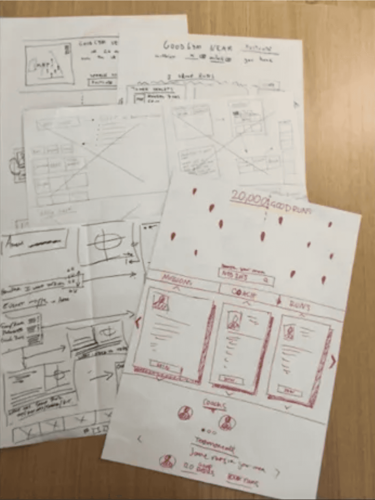
Paper Prototype - Guerrilla User Testing
Paper Prototype - Guerrilla User Testing
We then developed a paper prototype following the Nielsen Norman recommendations; five testers over three rounds of testing.
We then developed a paper prototype following the Nielsen Norman recommendations; five testers over three rounds of testing.
Key Findings First Round of Testing:
Use sketches rather than paper cut-outs to keep in tone with our design intentions.
Map/information better displayed horizontally.
There was misunderstanding as to how running and good-deeds worked together.
Key Findings First Round of Testing:
Use sketches rather than paper cut-outs to keep in tone with our design intentions.
Map/information better displayed horizontally.
There was misunderstanding as to how running and good-deeds worked together.

First Round Of Testing - Version one with a scrolling first page and A/B testing of the second stage.
First Round Of Testing - Version one with a scrolling first page and A/B testing of the second stage.
Second Round of Testing
Second Round of Testing
Key Findings Second Round of Testing:
Explain ‘Do Good’ & ‘Get Fit’.
Demonstrate the three run types with three clear comparisons.
Preference to full-screen map rather than half screen.
Explain ‘Do Good’ & ‘Get Fit’.
Demonstrate the three run types with three clear comparisons.
Preference to full-screen map rather than half screen.
Third Round of Testing
Third Round of Testing
We then developed a paper prototype following the Nielsen Norman recommendations; five testers over three rounds of testing.
We then developed a paper prototype following the Nielsen Norman recommendations; five testers over three rounds of testing.
Key Findings Third Round of Testing:
Use sketches rather than paper cut-outs to keep in tone with our design intentions.
Map/information better displayed horizontally.
There was misunderstanding as to how running and good-deeds worked together.
Key Findings Third Round of Testing:
Use sketches rather than paper cut-outs to keep in tone with our design intentions.
Map/information better displayed horizontally.
There was misunderstanding as to how running and good-deeds worked together.
First Round Of Testing - Version one with a scrolling first page and A/B testing of the second stage.
First Round Of Testing - Version one with a scrolling first page and A/B testing of the second stage.
Third Round of Testing
Third Round of Testing

Key Findings Third Round of Testing:
Don’t get the connection between running and helping the older people.
Top of first page should have a better explanation/introduction line; not simply outlining the goal/tagline.
Better with small interactive icons on landing site for each event rather than the ‘Find Out More’ button.
We then proceeded to developing wireframes using ‘sketch’.
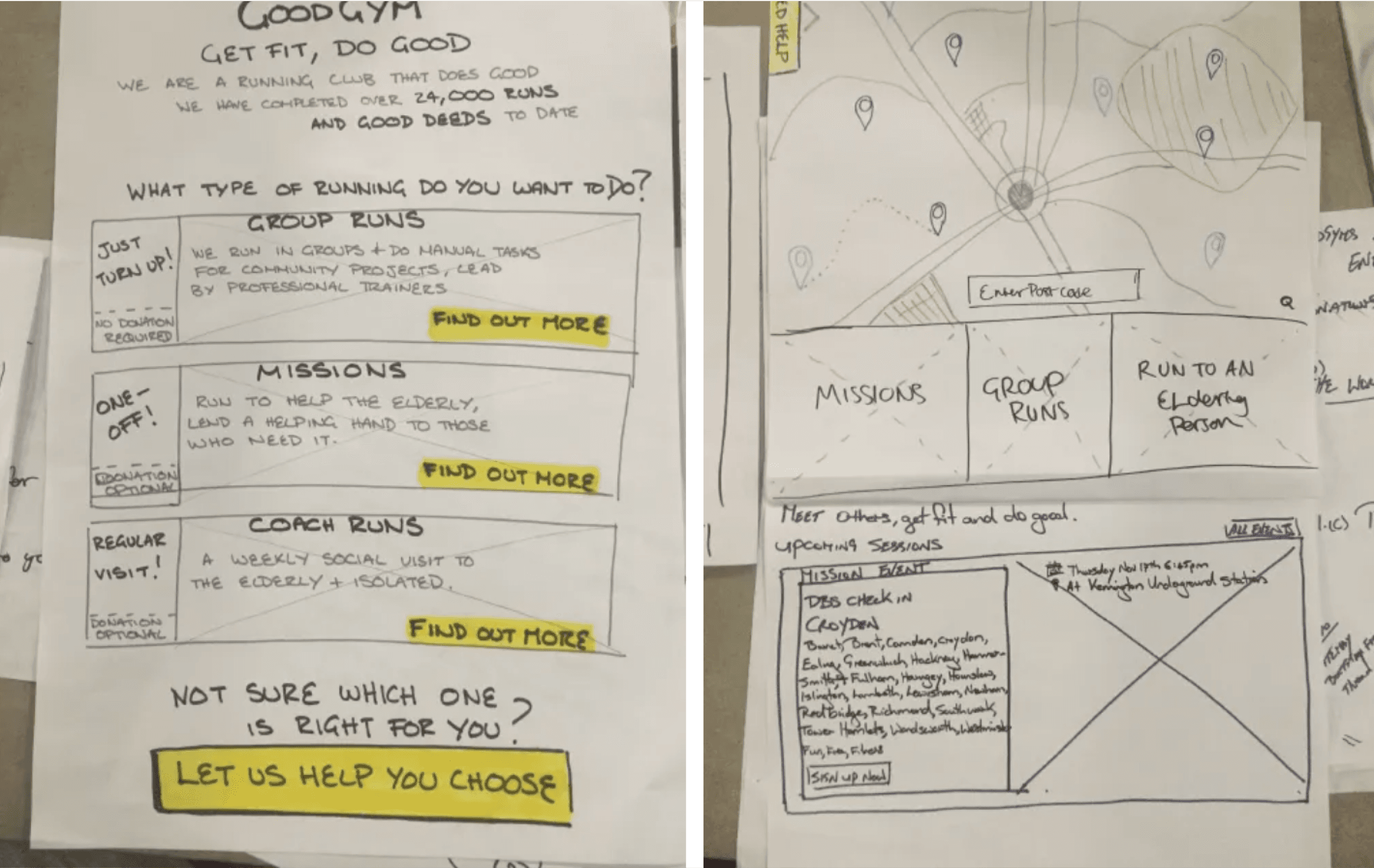
Wireframe Designs
Wireframe Designs
During testing we discovered that although the information pages had been changed, users still had some questions left unanswered that disrupted their journey through to full sign-up.
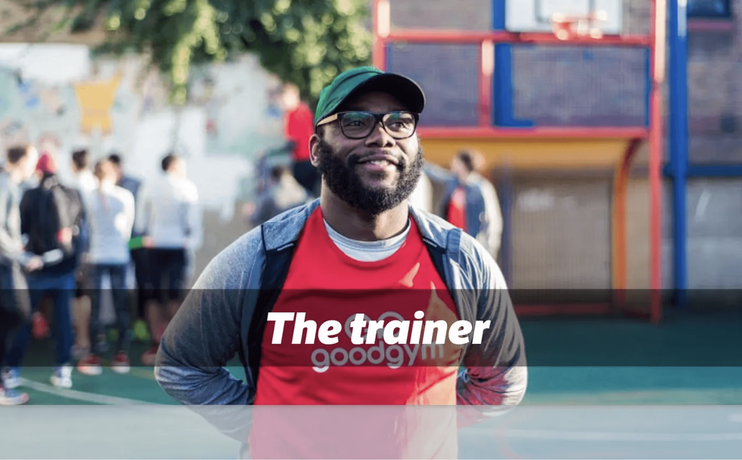
We tested the idea of having a digital guide in place, we termed the ‘trainer’. This would be in keeping with the style of the site. Testing found this to be much more helpful and we improved upon it with iterations.
We carried out various testings and iterated on the results.

If you chose to use the guide or ‘Coach’ by clicking “Let us help you chose”, you go to these pages.
We have used the group run as an example.
If you chose to use the guide or ‘Coach’ by clicking “Let us help you chose”, you go to these pages.
We have used the group run as an example.
“What would you like to do most?”
“What would you like to do most?”
Sequential ‘Coach’ facilitating an informed flow.
Sequential ‘Coach’ facilitating an informed flow.
“OK, so how much time could you give to this?”
“OK, so how much time could you give to this?”


“And what type of event would interest you?”
“And what type of event would interest you?”
You are taken to the map view of your area, where all the local events are displayed.
You are taken to the map view of your area, where all the local events are displayed.


Choosing an event location on the map page highlights that event and takes you to the signup page below.

Our Deliverables
Our Deliverables
Having signed up you are given:
* An overview of the event type
* Location
* Timings
* Need to know’s about the event
* Other members of the running group who will be
attending
* Your trainer who will run the event
* An infographic breaking down the event into clear stages
* Finally a button to confirm your place

Group Run, Landing Page with Three Hover and Click Options.
In this example the Group Run has been selected.

Where Do We Go From Here
Where Do We Go From Here
There was a need to better define the terminology on the pages as users found it confusing
There was a need to further streamline the signup flow and we thought work we had done required careful implementation
We also thought that an app supported by mobile devices was both an important and obvious addition
We suggested the three-step implementation plan to enable GoodGym.org a way to adopt the new changes in a step-by-step process, secured with further testing at each stage
We carried out usability testing with our clickable prototype with users which gave much improved results around information, navigation and ease of use.


WhatsApp and Phone Number
Address:
25 Lloyd Court, Pinner, London, HA5 1EF
WhatsApp and Phone Number
Address:
25 Lloyd Court, Pinner, London, HA5 1EF
WhatsApp and Phone Number
Address:
25 Lloyd Court, Pinner, London, HA5 1EF